JENNIFER BECKER

CASE STUDY
Customer Journey
Redesigning the Agent Experience with Unified
Context and Inclusive Design
Senior Product Designer – Research, Vision & UX Strategy
Project Overview
To improve the performance of its browser-based contact center application, Avaya aimed to unify fragmented customer data, reduce agent screen-switching, and offer a full view of customer interactions across all channels.
I was part of a unique team—three Product Managers and myself, the Senior UX Designer—charged with breaking away from legacy thinking. We were asked not to iterate on what existed but to imagine what was possible. A partner firm had interviewed agents and supervisors, uncovering real-life frustrations, inefficiencies, and missed opportunities. After hearing those stories, I realized: I never wanted to be an agent—but I absolutely wanted to make their work easier.
Our design challenge came down to six persistent questions agents kept asking:
-
Who is our customer?
-
Where are they calling from?
-
When did they last reach out?
-
How are they feeling?
-
What happened during their last visit?
-
Where are our notes
If we could answer those six questions—clearly and quickly—
we could unlock not only a better experience but a real competitive advantage.
Process & Collaboration
Research
-
Interviewed agents & supervisors to capture day-to-day pain points
-
Partnered with Sales to surface unmet user and business needs
-
Mapped out emotional & workflow friction points (the “6 key questions”)
Define
-
Created personas & end-to-end journey flows
-
Aligned user needs with product strategy
-
Prioritized issues like note visibility, data silos, and emotional stressors
Ideate
-
Led ideation workshops with PMs and engineers
-
Brainstormed UI solutions for context-sharing, sentiment, and clarity
-
Proposed timeline + card model to simplify fragmented data
Prototype
-
Built Figma prototypes with deep annotations
-
Introduced sentiment cues, filters, interaction cards, and contextual notes
-
Designed with accessibility in mind (landmarks, tab order, screen reader structure)
Test
-
Ran continuous feedback loops every 2 weeks
-
Iterated on hierarchy, speed, and screen reader navigation
-
Adjusted layouts and admin settings based on engineering constraints & real user feedback
Key Challenges
Pain Points from Research
-
Lack of centralized notes.
-
Confusing, fragmented history lists.
-
No unified interaction timeline.
-
Overwhelming interfaces with no prioritization.
-
Emotionally difficult interactions with little support.
Technical Constraints
-
Siloed APIs between Customer Journey and Contact Center systems.
-
No unified customer ID across tools.
-
Infrastructure limitations for AI and live sentiment tracking.
Before: Disconnected Systems

After: Unified Customer Journey

Design Highlights
Interactive Timeline
-
A scrollable, channel-organized timeline showing customer events and contact points.
-
Zoomed-in views with contextual summaries (Selected Timeline View).
Interaction Details Card
-
Rich cards showing transcripts, outcomes, tags, and agent information.
Sentiment Indicator
-
Real-time emotional cues (AI-driven) to help guide agent tone and empathy.
Filters & Search
-
Control view by department, product, time, or inquiry type—customizable via admin settings.
Notes Panel
-
Persistent, in-context notes visible across sessions and shared with supervisors.
AI Recommendations Context-aware suggestions and quick access to relevant knowledge base articles.
Domain-specific Customer Journey Use Cases


Original Idea

Screenshot of the first draft of the Avaya customer journey interface showing timeline view with all the possible communication channels (SMS, Email, Video, Voice, Social, Chat, Contact). The image shows all the touchpoints but there are no details to help an agent understand why they called and what is going on.
Iteration 1

Screenshot of Avaya agent interface iteration 1 showing customer details for Mary Martin on left and expanded timeline on right with detailed touchpoint breakdown including Medicare enrollment form, chatbot interactions, and IVR data. Agents found this too detailed.
Accessibility & Inclusive Design
From the start, it was essential that the Customer Journey Widget serve all users—including those using assistive technologies. I collaborated with our Accessibility Tester to ensure the timeline and its views were fully navigable by keyboard and screen reader users.
Inclusive strategies included:
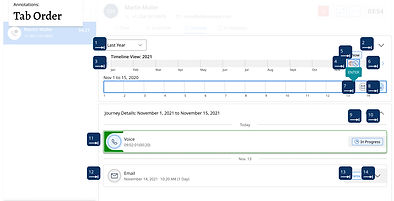
1. Logical Tab Order & Region Navigation
Structured the app using ARIA regions to support efficient keyboard navigation (F6)
3. Clear Headings & Labels
Every component—cards, filters, buttons—had accessible names and headings to support screen reader parsing.

2. Skip Navigation Landmarks
Enabled users to jump directly to core content areas: Main Timeline, Selected Timeline, and Interaction Card View.

4. Optimized Tooltips
Provided rich tooltip descriptions on each touchpoint, allowing agents to preview information without digging. Accessibility Annotations Integrated directly into Figma to guide developers during implementation.

Outcomes & Impact
Unified Agent View
Agents could now access a complete view of customer interactions, across any channel, in one interface.
Improved Onboarding & Confidence
Clarity, organization, and inclusive design made the tool easier for new agents and those with different levels of ability.
Enterprise Flexibility
Admin settings empowered businesses to tailor the experience by region, department, or customer journey type.
Strategic Visibility
The widget enabled agents to answer customers’ six key questions—faster and with more confidence. Whether a customer starts with an email, follows up via chat, or escalates to a call, their history follows them. At every stage, the agent has full context—making it easier to meet expectations and reduce friction.
Design Anatomy
Designed and iterated on key concepts:
-
An interactive, scrollable timeline organized by channel.
-
Selected Timeline View: A zoomed-in portion of the timeline with interaction-specific summaries
-
Interaction Details Card: Summarizes sessions with transcripts, tags, and agent details.
-
Sentiment Indicator: Visual emotional cues to help guide agent tone.
-
Filters: Control visibility by product, time, department, or type of inquiry
-
Notes Panel: In-context documentation viewable by other agents or supervisors.
-
AI recommendations and knowledge


Reflection
This project reinforced that great design is both empathetic and strategic.
By listening to agents, understanding system limitations, and prioritizing inclusive, flexible experiences, we delivered a tool that brought clarity to chaos. Accessibility wasn’t a separate phase—it was part of every decision.
Although the widget is still in rollout stages, the impact has already been felt:
-
Other product teams have borrowed from our interaction models.
-
Sales is leveraging the widget as a differentiator.
-
Agents are reporting fewer escalations and more confidence.
Designing for everyone isn’t an extra step—it’s the foundation. Accessibility helped us simplify complexity, clarify structure, and support all agents—because true usability includes everyone.
“Jenn consistently went above and beyond to deeply understand our customers—their pain points, behaviours, and unmet needs. She transformed those insights into elegant, intuitive designs that not only met expectations but exceeded them… Jenn is strategic, collaborative, and always willing to go the extra mile. I would work with her again in a heartbeat!”
Yvonne Aherne,
Product Manager, Avaya
“Jenn always delivered so much more than what she was tasked with and created designs that held their own against our biggest competitors. Highly recommend her as a fantastic asset to any team.”
Danushka Migel Wasam
Software Engineer, Avaya