JENNIFER BECKER

CASE STUDY
Workflow Designer
Reimagining a Visual Call Center Workflow Tool
for Accessibility and Usability
Senior Product Designer – Research, Vision & UX Strategy
Project Overview
I’ve always loved workflow tools — their power lies in making complexity manageable. After working with customers directly on earlier versions of this call flow product, I understood both its potential and its pitfalls. While users loved the concept, many struggled with the actual experience: it was too technical, unintuitive, and completely inaccessible to users with disabilities.
When I was asked to lead the UX and accessibility redesign of this drag-and-drop call routing system, I saw an opportunity not just to fix flaws — but to redefine what inclusive workflow design could look like.
Our Goal
Transform a legacy tool into an accessible, intuitive, and WCAG 2.1 AA-compliant experience — without sacrificing advanced functionality.

Process & Collaboration
Research
-
Ran full UX audit to identify core usability issues
-
Conducted accessibility audit using WCAG 2.1 AA standards
-
Performed competitive analysis (Twilio Studio, Genesys Architect, Salesforce)
Define
-
Created detailed personas across technical and non-technical roles
-
Mapped key workflows for dispatchers, managers, and DIY users
-
Identified gaps in task clarity, data loss, and interaction predictability
Ideate
-
Built low- and high-fidelity concepts in Figma
-
Designed drag-and-drop alternatives for keyboard and screen reader users
-
Planned interface logic to prioritize clarity and safety for all roles
Prototype
-
Created annotated designs with embedded accessibility specs
-
Included ARIA, color contrast, tooltip logic, and tab orders in design files
-
Enabled contextual side panels as non-visual build options
Test
-
Facilitated dev workshops using real assistive tech demos
-
Led bi-weekly design reviews and usability test sessions
-
Iterated based on accessibility gaps, user feedback, and engineering constraints
Problem Framing
When Power Comes at a Cost
The existing product enabled users to build and manage call center logic visually. But it came with critical UX and accessibility issues that blocked adoption, especially in small to mid-sized companies where workflow creation falls on non-technical roles like business owners or IT specialists.
Accessibility Barriers (Before Remediation)
The original design presented several significant accessibility challenges that limited usability for people with disabilities. Key barriers included:
1. Keyboard Navigation Gaps
-
Issue: Interactive elements, such as buttons, were not properly focusable using a keyboard.
-
Impact: Users who rely on keyboard navigation (e.g., users with motor disabilities or screen reader users) could not access or operate essential controls.
2. No Visible Focus Indicator
-
Issue: There was no visible focus indicator when using keyboard navigation.
-
Impact: Users navigating with a keyboard could not visually track where they were on the page, leading to confusion and inaccessibility.
3. Lack of Navigational Landmarks
-
Issue: The canvas interface lacked landmarks (such as <nav>, <main>, or ARIA landmarks) to define key regions of the page.
-
Impact: Screen reader users could not quickly move between meaningful sections like tools, content areas, or results.
4. Screen Reader Incompatibility
-
Issue: Screen readers failed to announce changes in focus or updates to the interface.
-
Impact: Users were unaware when actions occurred, such as selection changes or item placement.
5. Insufficient Color Contrast
-
Issue: Task types and labels used colors with low contrast against the background.
-
Impact: Users with low vision or color blindness had difficulty distinguishing tasks or reading key information.
6. No Alternative to Drag-and-Drop
-
Issue: The core functionality depended entirely on mouse-based drag-and-drop with no keyboard or alternative method provided.
-
Impact: Users with motor impairments or screen reader users could not complete core tasks.
Found Accessibility Issues
Accessibility audit revealed critical contrast failures: unreadable table text (image 1) and low-contrast canvas actions (image 2). Red highlights indicate problem areas requiring immediate remediation for WCAG compliance.


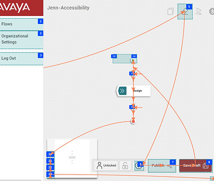
Accessibility testing tool displaying keyboard navigation flow. Numbered blue boxes show tab order sequence, orange lines trace focus path. Reveals gaps where users cannot reach critical interface elements via keyboard alone.
UX & Usability Challenges (Before Redesign)
Beyond accessibility compliance, the original design suffered from several UX and usability issues that impacted all users — especially those with cognitive, visual, or motor impairments. These problems led to user confusion, errors, and frequent abandonment.
1. Contextless Navigation
-
Issue: Users could accidentally exit a task mid-way, with no warning or prompt.
-
Impact: Important work was often lost without confirmation, especially for users with memory or attention limitations.
-
Best Practice: Use clear navigational cues and interruption modals to prevent accidental exits.
2. No Autosave or Confirmation Modals
-
Issue: Progress was lost if users closed or refreshed the page.
-
Impact: This led to frustration, especially for users with slower motor skills or cognitive processing delays.
3. Misleading Logout Behavior & Confusing Task Flow Names
-
Issue: "Logout" did not behave consistently, and task flows used internal or developer terms.
-
Impact: Users misinterpreted flows, exited unintentionally, and failed to complete key processes.
-
Best Practice: Use user-centered labeling consistent with mental models and industry standards.
4. Inconsistent Task Visuals
-
Issue: Tasks lacked categorization, consistent icons, or visual hierarchy.
-
Impact: Users couldn’t scan or organize information efficiently, making task-switching cognitively demanding.
5. Critical Actions Poorly Placed
-
Issue: Important controls like "Publish" were floating in ambiguous areas of the canvas.
-
Impact: Users could mis-click or miss the action entirely, especially on smaller screens or with mobility impairments.
-
Usability Concern: Primary actions should have fixed placement and visual priority.
6. Users Felt Lost
-
Insight: The lack of structure, feedback, and clarity didn’t just confuse users — it made them feel disoriented and unsupported.
-
Impact: Emotional friction led to lower engagement and trust in the system.
-
UX Goal: Interfaces should guide, reassure, and reward user progress.
7. Developer-Centric Labels
-
Issue: Labels and button text reflected developer language, not terms used by users or seen in comparable workflow tools.
-
Impact: Increased learning curve, especially for new or non-technical users.
-
UX Principle: Speak the user’s language, not internal jargon
8. Inconsistent Styling and Code
-
Issue: Fonts, sizing, and layout of tasks varied from screen to screen.
-
Impact: This disrupted visual consistency and predictability.
Usability Issues
The interface showed two buttons styled as primary actions on the same screen, creating confusion about which action to take. This breaks standard UI patterns and makes it harder for users to identify the intended next step.Best Practice: Each screen should have one clear primary action, styled to stand out from secondary options.

Requird fields Issues
Required fields in the form did not follow accessibility or UX standards for labeling. Instead of using a visible asterisk (*) or plain language indicators near the form label, the design placed this information where error messages would normally appear — after the user submitted the form.
Pivotal Moment: Building Empathy
Many developers initially resisted the accessibility work. “Why would someone with a disability use this tool?” they asked. Instead of pushing back, we invited them into the experience. Through screen reader simulations, keyboard demos, and structured training, we helped them hear and feel what users experience. It was transformative. The resistance turned to advocacy — and our engineers began flagging accessibility gaps on their own.
Solutions & Design Highlights
Accessibility & Inclusivity
-
Keyboard interaction model for drag-and-drop canvas navigation
-
ARIA roles and focus management for screen reader compatibility
-
Contextual panels as non-visual alternatives to drag
-
Accessible iconography and color contrast fixes
-
Developer tooling: ANDI, Bookmarklets, and Chrome DevTools integrated into design review

Improved Keyboard Navigation
Added keyboard annotations to enable seamless tabbing through major actions and the start component. Users can now press Enter to dive into the task flow and navigate each step using the Tab key—no mouse required.
UX Improvements
-
Autosave + exit warnings prevented accidental data loss
-
Flow name repositioned outside canvas for layout clarity
-
Top-nav placement for critical actions (Save, Publish) to reduce mis-clicks
-
Task standardization with labeled icons, color coding, and logical grouping
-
Confirmation modals for high-risk actions (like cloning or publishing)
-
All designs were built using Avaya’s Neo Design System, ensuring consistency and reusability across teams.


Outcome & Impact
Although the business ultimately chose to adopt a third-party tool, our work left a powerful legacy:
-
Accessibility compliance: Product on track to meet WCAG 2.1 AA standards
-
Design artifacts reused: Our UX and accessibility models became templates for other teams
-
Improved task success: Usability testing showed higher user trust and fewer errors
-
Cultural shift: Dev and PM teams now consider accessibility upfront in planning
-
Raised the bar: Our design system components became new internal benchmarks for inclusive enterprise UX
Reflection
This project proved what I’ve believed for a long time: accessibility isn't a compromise — it’s a catalyst for better design. By building empathy, aligning stakeholders, and grounding every decision in user needs, we didn’t just improve a product — we helped shift how our company thinks about who we’re building for. Even though this specific product didn’t launch, the work lives on in our systems, our teams, and our approach to inclusive innovation.
What’s Next?
I’m excited to take these lessons into future projects — especially those involving canvas tools, configurable systems, or complex interaction models. These are the exact moments where accessibility can be transformative — and where design has the power to make everyone feel capable.